Working on integrity
communication taught me that credibility is a design material - built chart by chart, report by report.
ATHLETIC
INTEGRITY
UNIT
OVERVIEW

The Athletic Integrity Unit safeguards clean sport worldwide.For three years I was AIU's lead designer, shaping their entire visual language - from annual reports and event design to social media for an organization whose work spans 135 countries.
ROLE

Lead designer
(via Penceo)
SCOPE

Visual direction and hands-on design — annual reports, infographic systems, social media, presentations, event design
CLIENT

Athletics Integrity Unit
YEAR

2019 - 2021
Context& problem
AIU communicates about doping - a subject where credibility is everything and audiences range from skeptical media to athletes scrolling Instagram.
When I joined, their channels were run by the education team without a visual system: event snapshots, reposted partner graphics in third-party branding, no consistent typography or grid - functional, but with no voice of its own. The organization needed to look like what it is: a serious, independent institution - without losing the energy of sport.
My role
I joined as one of several designers on the account and quickly became its lead. AIU chose to schedule projects around my availability rather than work with rotating designers — for three years I set the visual direction, proposed new formats, guarded consistency across everything they published, and worked directly with the client, developing new ideas together on calls.And I designed all of it myself: every chart, every layout, every post in this case study came off my desk.
How the system was built
Key design decisions
Decision 01
An infographic system, not one-off charts
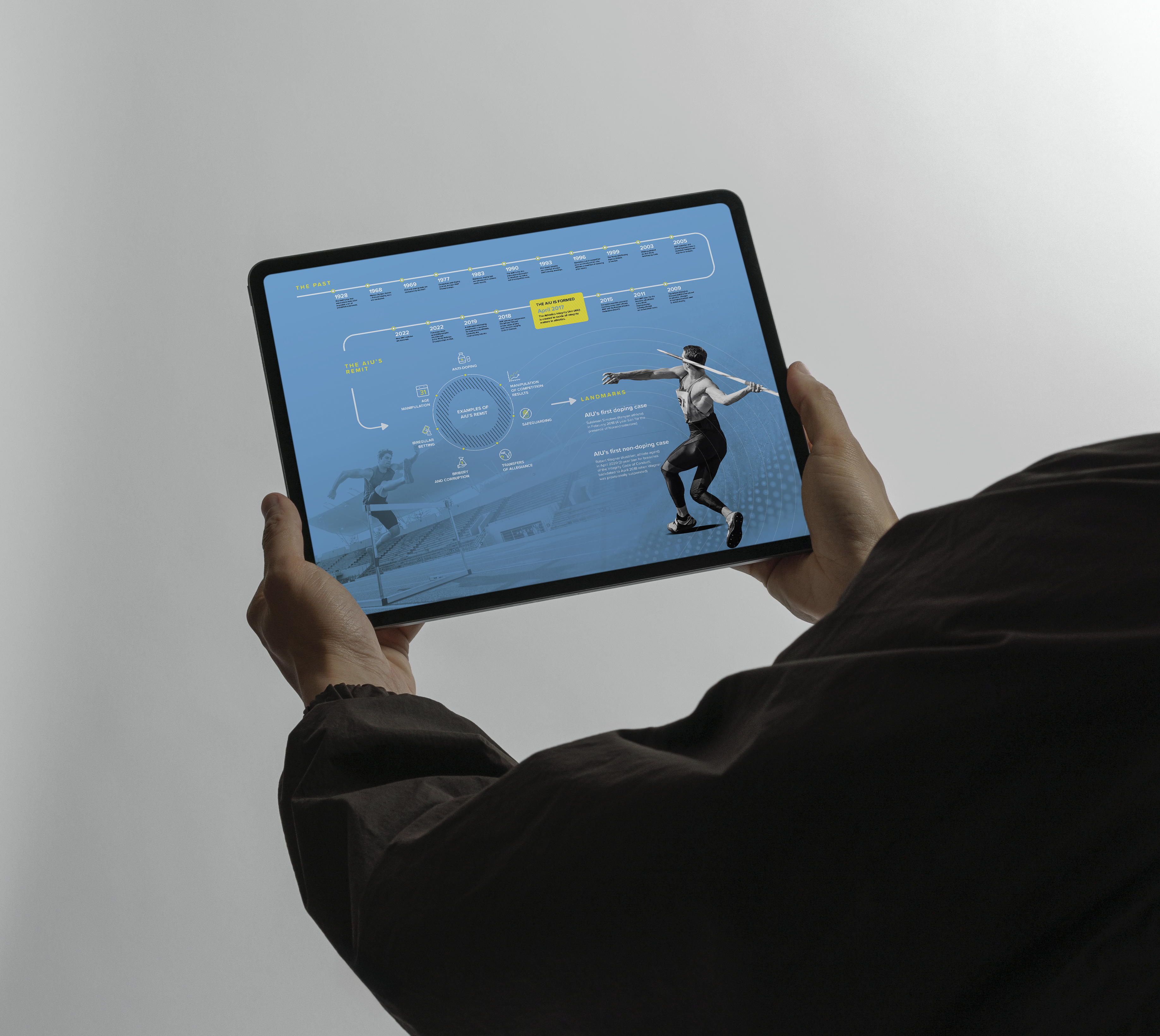
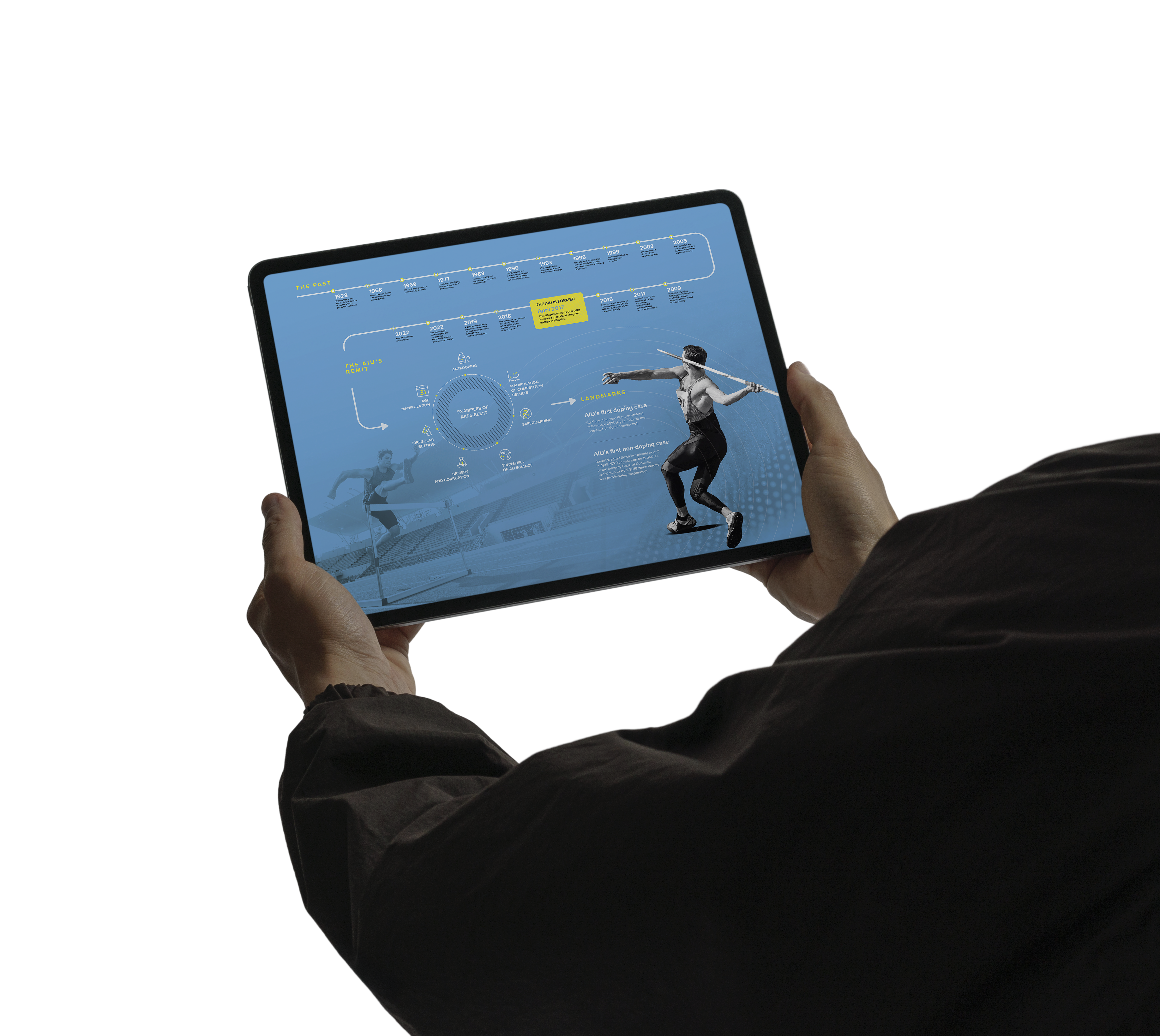
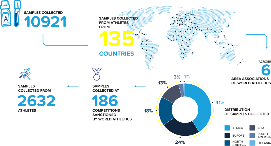
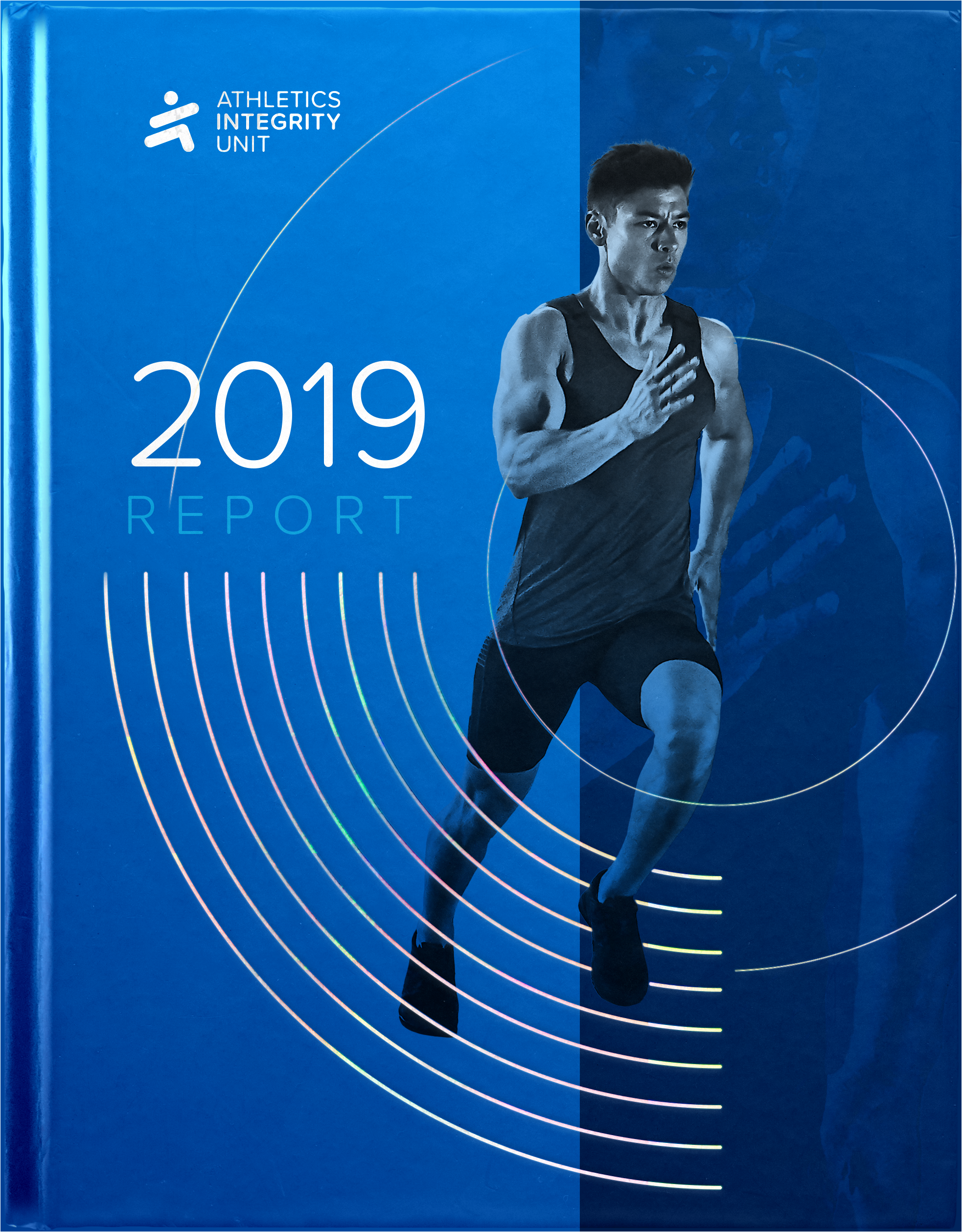
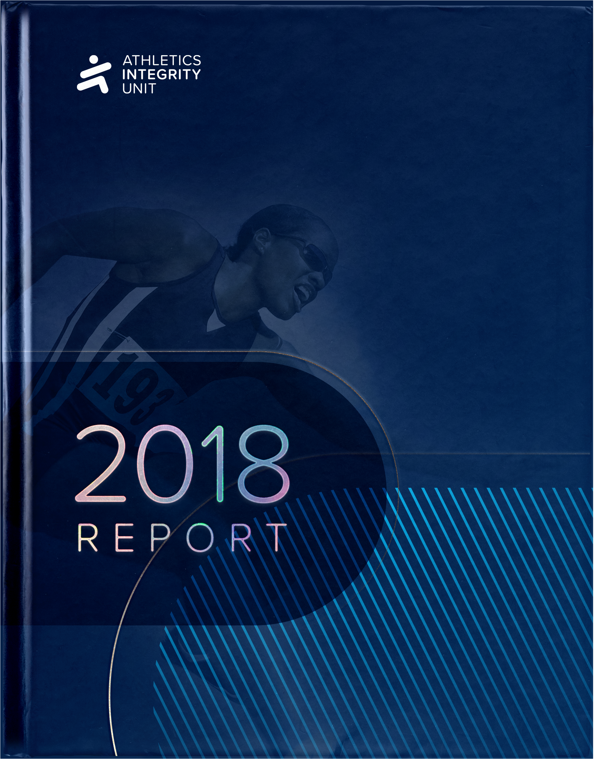
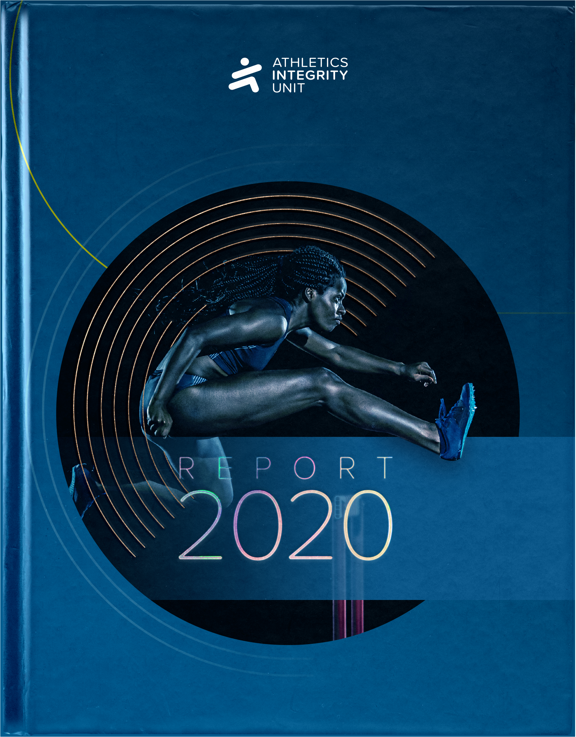
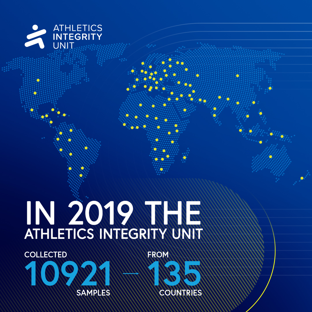
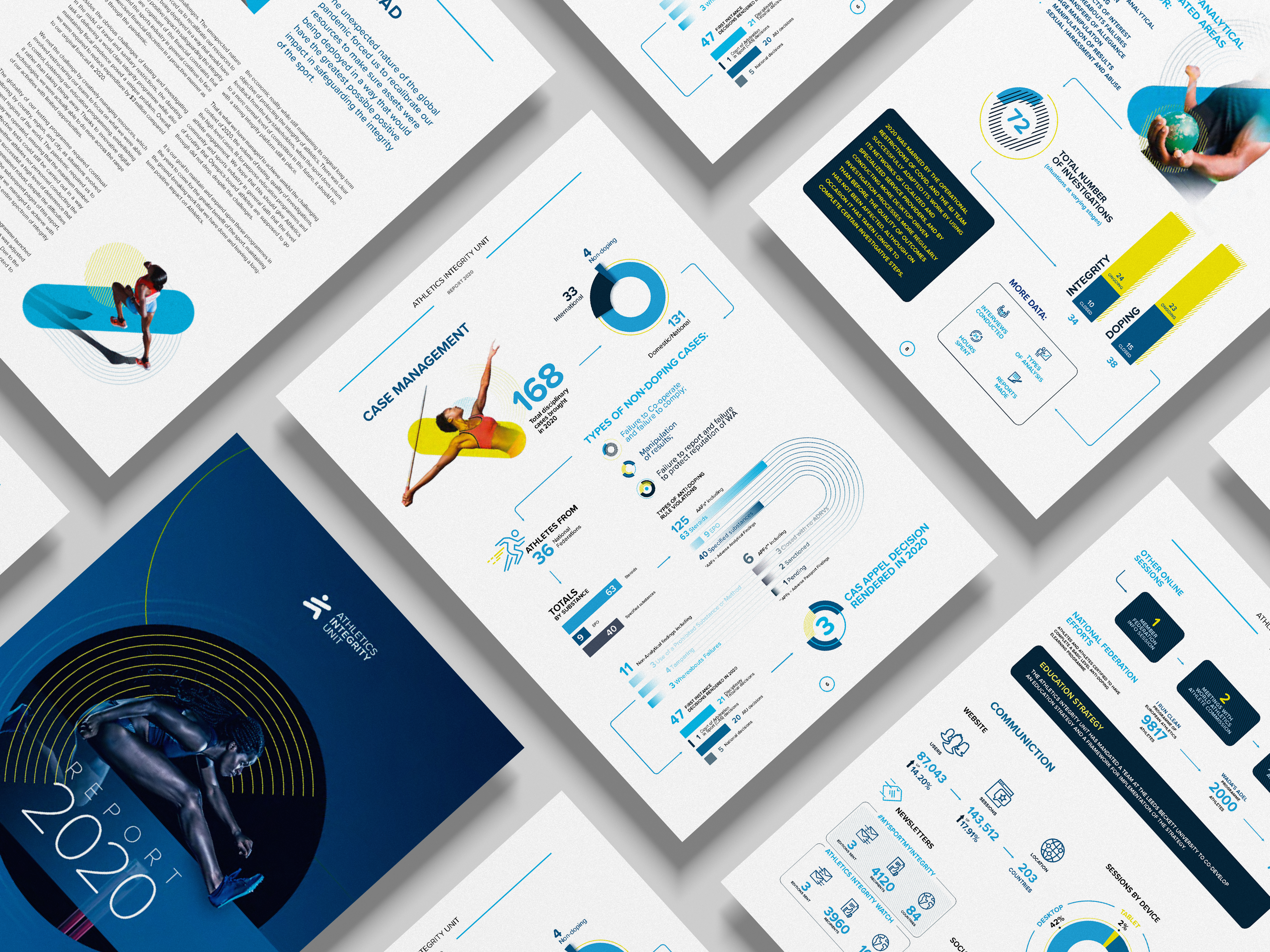
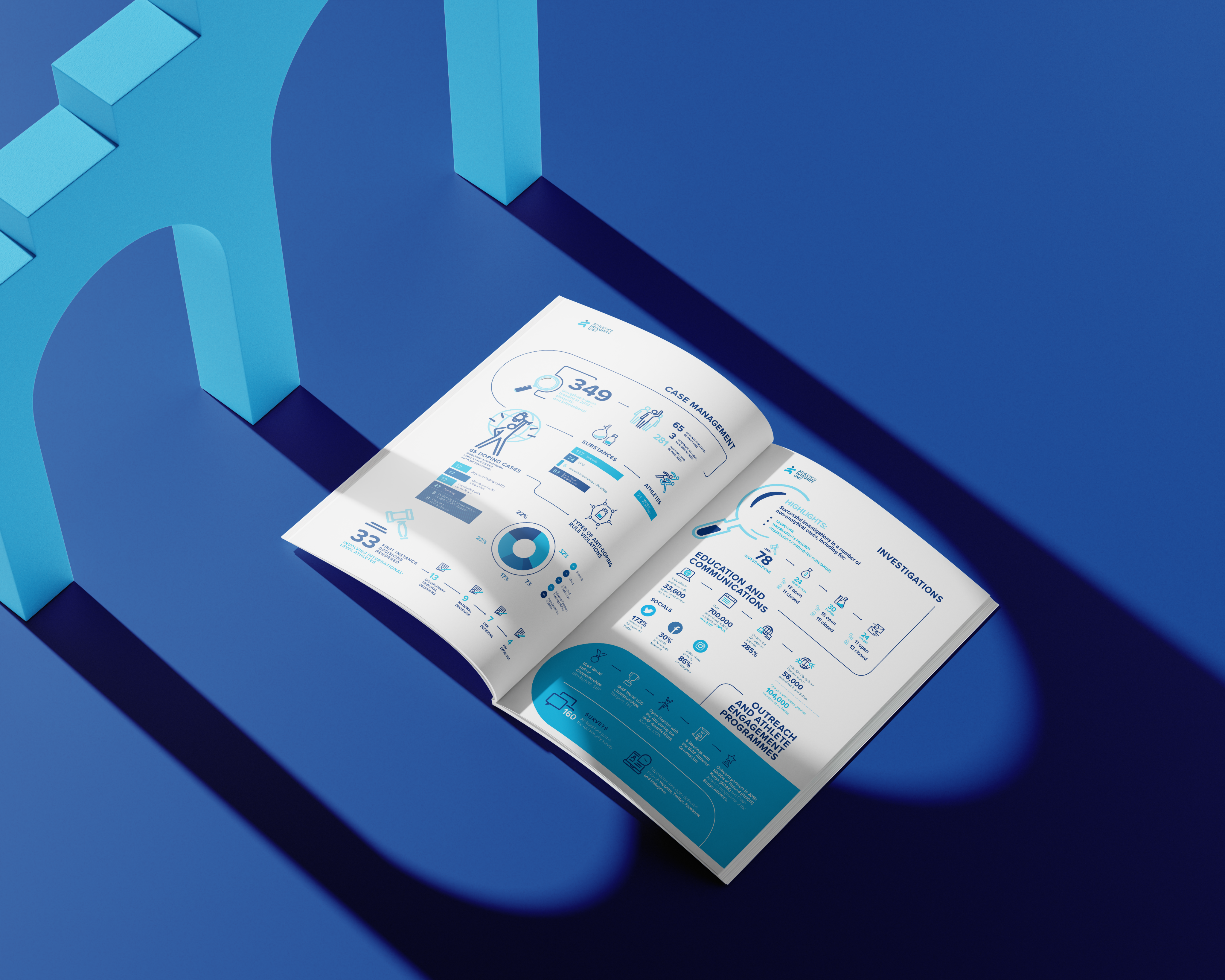
For the annual reports I built a reusable visual language for testing data, geography and case statistics: a modular grid for data spreads, a numeral treatment that keeps large figures readable at report and social sizes, a custom icon set for sample types and sanctions, and chart behaviours that hold up whether a dataset has three values or thirty. Dense integrity numbers became something media could quote and athletes could actually read — and the system proved durable, continued and expanded in the following years' reports.

Decision 02
One language, two registers
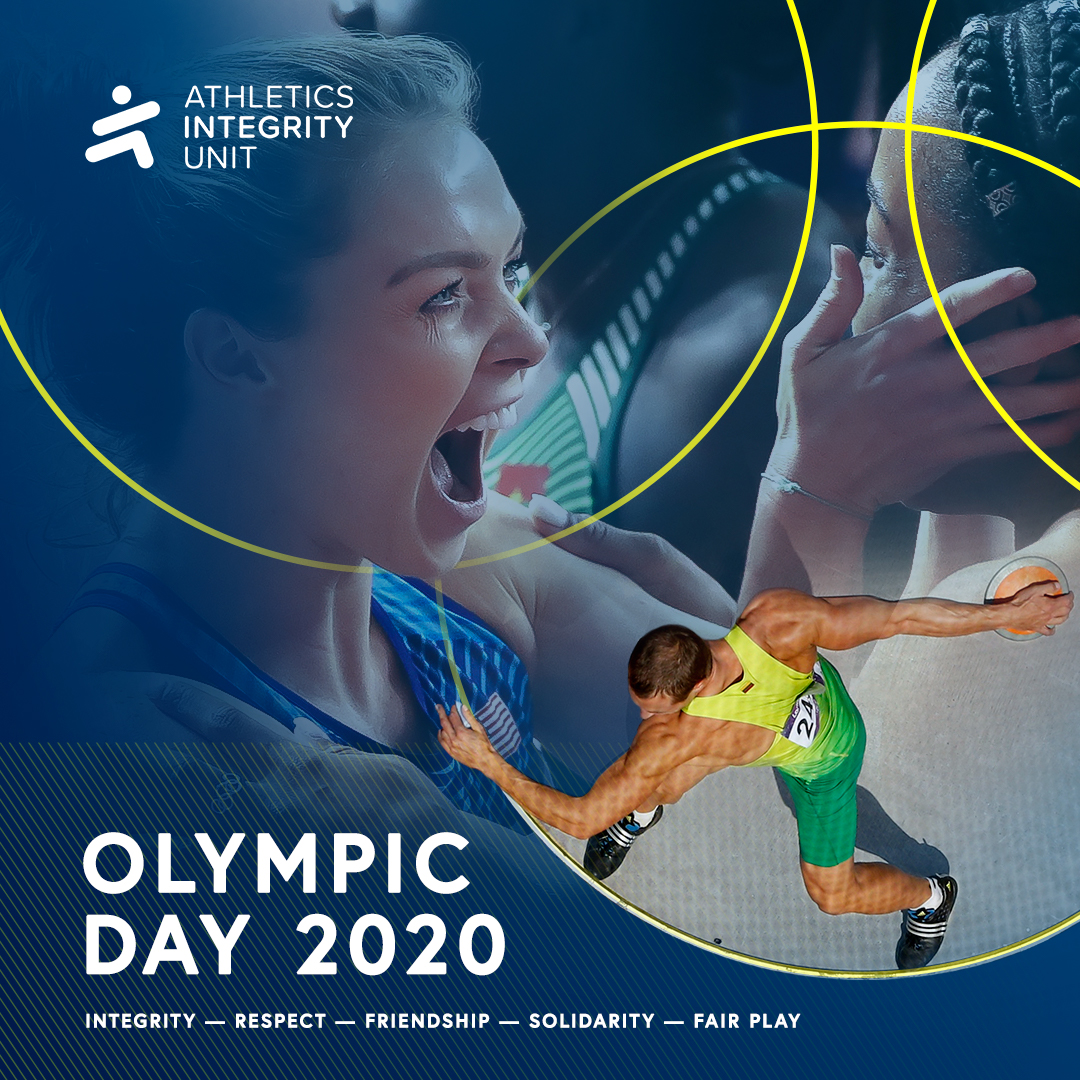
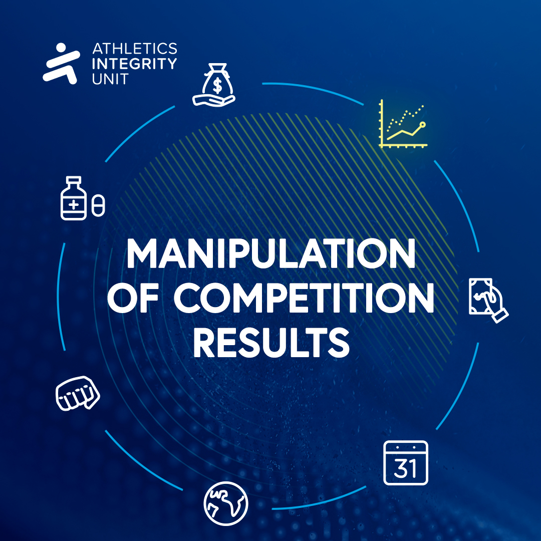
The same foundations - grid, type scale, colour logic, image treatment — carry an institutional annual report and an Instagram post about whereabouts deadlines.I drew both ends of that range myself, which is exactly why the system stayed honest: nothing was specified that I hadn't already produced at deadline speed.It kept AIU consistent whether addressing federations or young athletes, and made monthly social production efficient, because every post started from the system, not from scratch.
Turning complex data
and global campaigns
into one cohesive
brand story.
From Instagram posts to international reports, every
design element was part of one unified visual system.
The system in action
From reports to global campaigns


Outcome
Result
3
Years of collaboration
3
Annual reports
135
Countries in AIU's reach
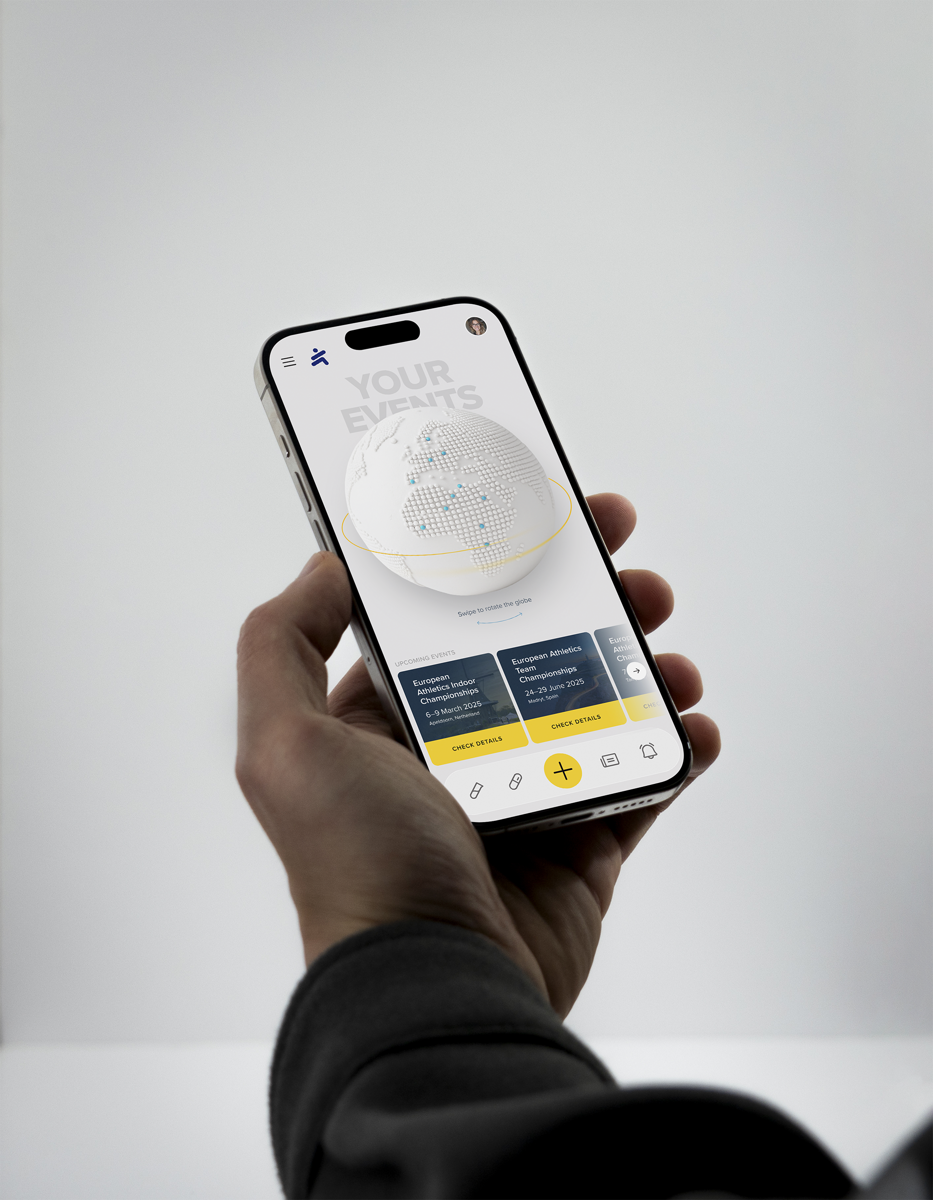
Continuous monthly social content, presentations, and full event design — rollups, backdrops, print — all recognisably one voice. Across three years, I was the only designer on the account: the direction and the execution were the same pair of hands. The infographic system outlived my involvement, carried forward in subsequent reports.
And the endorsement I value most was never written down:
AIU preferred to wait for my availability rather than brief anyone else.


PREVIOUS
NEXT


ALL PROJECTS