PENCEO
OVERVIEW

Penceo was the creative agency where I worked as Creative Director, delivering projects for international sports federations, luxury houses and global corporations. I designed its rebrand alone — concept, logotype, identity system and brandbook. Designing for your own agency means the audience is a room full of designers, and you're the one who has to live with the rules afterwards.
ROLE
Creative Director at Penceo - solo designer of the rebrand
SCOPE
Brand concept, logotype, identity system, brandbook, motion direction
YEAR
2023

01
The mark builds everything
The "P" is drawn from a single geometric construction — circle, angle, proportion, nothing arbitrary. That same construction generates the whole service icon set, so new services could be added later without redrawing anything.

Creative
Strategy

Social Media
& Digital
Marketing

Experience
Design

Motion Graphics
& 3D Animation

Community
& Campaign
Management

Web & Application
Development

Branding
02
The aurora behaves, it doesn't decorate
"Creativity in Motion" needed a visual that moves. But a rule you have to interpret is a rule that drifts. So the aurora ships as a single fixed file, static and animated, identical everywhere. Twelve designers, one aurora, nothing to argue about.
BLACK
RGB
HEX
CMYK
34 / 34 / 34
#222222
0 / 0 / 0 / 95
255 / 255 / 255
#FFFFFF
0 / 0 / 0 / 0
RGB
HEX
CMYK
WHITE

STATIC
AURORA
MOTION
AURORA
03
Restraint is the container
Clash Grotesk and a near-monochrome base keep the system quiet. The aurora carries the colour — and so does the client work. An agency brand should frame the portfolio, not compete with it.
DISPLAY
Light
Font size: 50ptLine height: 110%
Letter spacing: 0%
Elevating brandsto new heights.

STANDARD HEADLINE
Light
Font size: 24pt
Line height: 110%
Letter spacing: 0%
Elevating brandsto new heights.
PARAGRAPH
Regular/Medium
Font size: 12pt
Line height: 120%
Letter spacing: 0%
Elevating brandsto new heights.
SMALL
Medium
Font size: 8pt
Line height: 120%
Letter spacing: 7%
Elevating brandsto new heights.
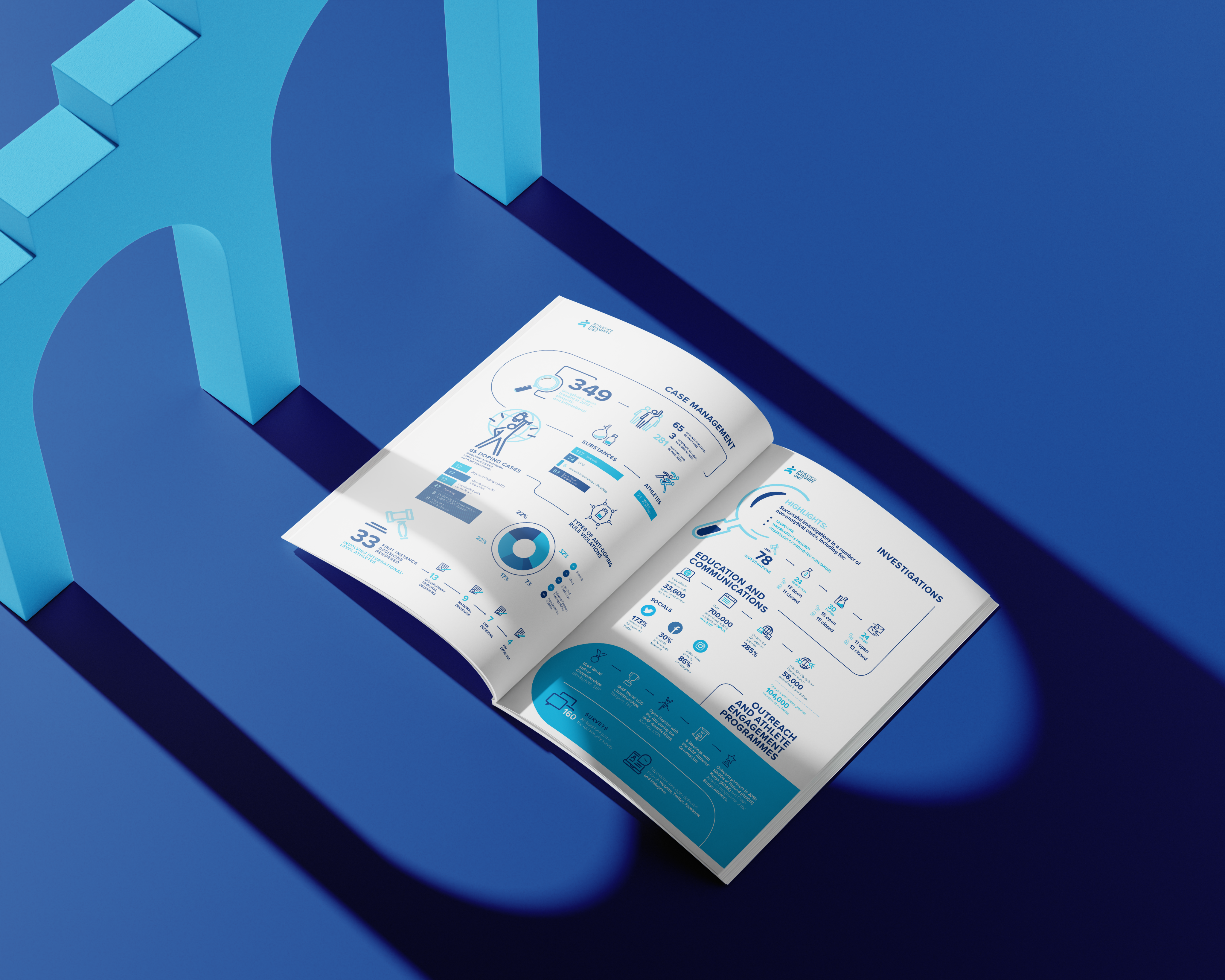

Branding - EDITORIAL
Annual report for the Athletics Integrity Unit.
Ten thousand tests, one visual system.

Good design doesn't need explaining.
Great design does.
That's why we writethings down.
Penceo - creativity in motion



Motion Graphics& 3D Animation
Brands that move are brands people remember.
From logo systems to full campaign animation.
Let's talk
penceo.com
The Website
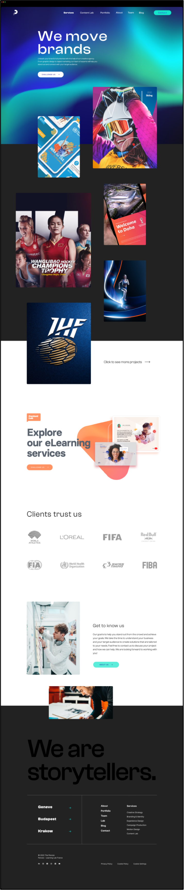
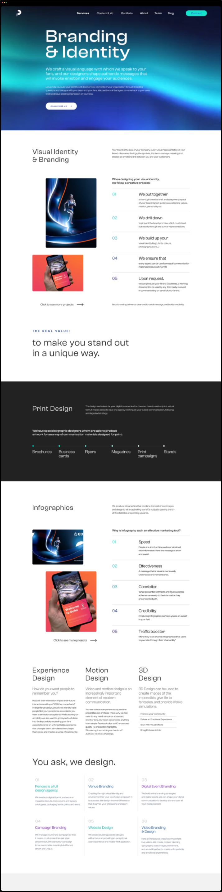
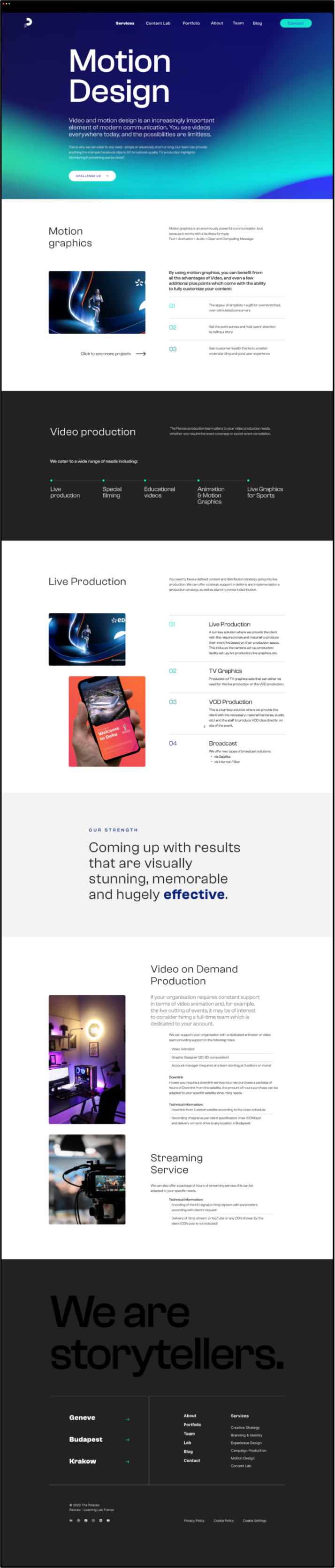
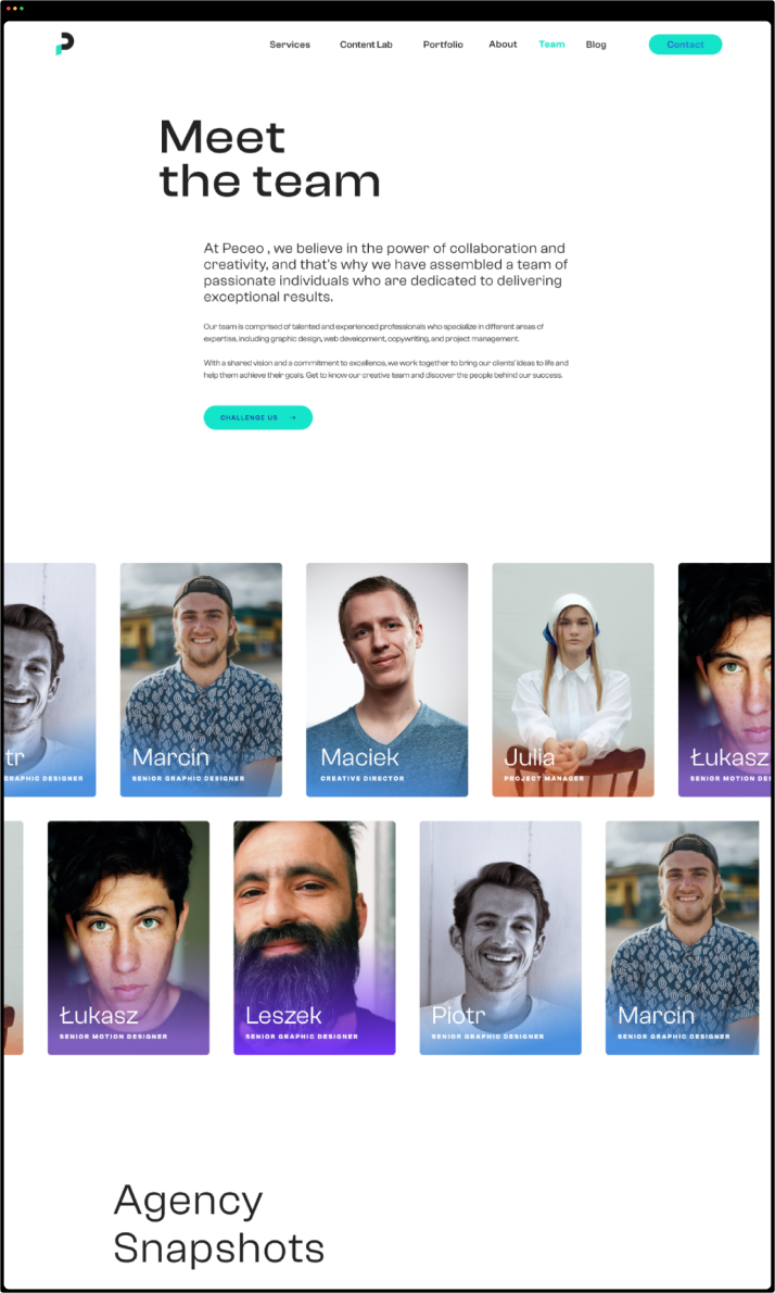
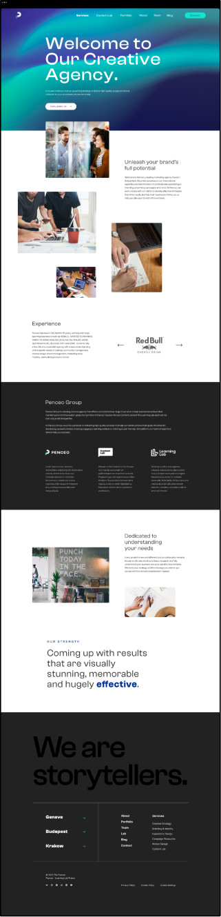
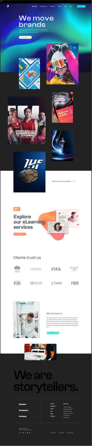
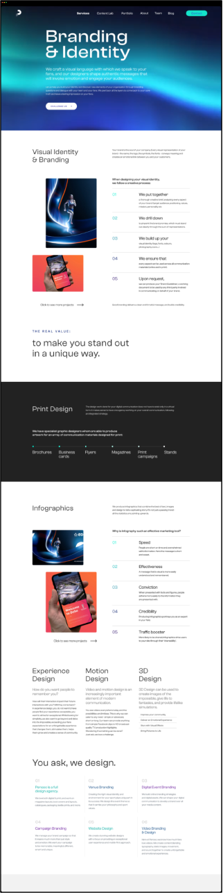
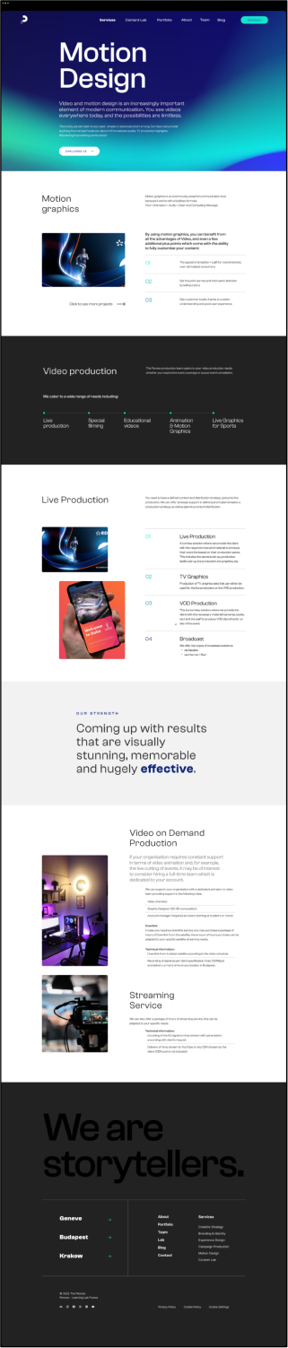
The site was the system's stress test. One page had to carry anti-doping reports, luxury retail training and corporate campaigns without switching voice — and do it while the aurora moved behind everything.
Dark by default, so client work supplies the colour. The mark holds one corner, the aurora holds the background, and nothing else competes.
The Brandbook
A brand is only as good as the day after launch. Twelve people, dozens of projects a year, no time to ask — so the book had to answer before anyone had a question.
Most of it is the unglamorous part: clear space, minimum sizes, what happens when the mark sits on a photograph, which six things you must never do to it. The kind of pages nobody reads for pleasure and everybody opens at 6pm on a deadline.
Concept — brand animation in exhibition space.
Outcome
Result
Rolled out across the website, proposals, social channels and internal communication. The identity ran until the studio closed. The aurora still does what it was built to do: it moves.
Designing for designers means you can't win on taste alone. You win by removing the room for interpretation.
Especially when you're the one enforcing it the next morning.

PREVIOUS
NEXT


ALL PROJECTS

PENCEO
OVERVIEW

Penceo was the creative agency where I worked as Creative Director, delivering projects for international sports federations, luxury houses and global corporations. I designed its rebrand alone — concept, logotype, identity system and brandbook. Designing for your own agency means the audience is a room full of designers, and you're the one who has to live with the rules afterwards.
ROLE

Creative Director at Penceo - solo designer
of the rebrand
SCOPE

Brand concept, logotype, identity system,
brandbook, motion direction
YEAR

2023
01
The mark builds everything
The "P" is drawn from a single geometric construction — circle, angle, proportion, nothing arbitrary. That same construction generates the whole service icon set, so new services could be added later without redrawing anything.

Creative
Strategy

Social Media
& Digital
Marketing

Experience
Design

Motion Graphics
& 3D Animation

Community
& Campaign
Management

Web & Application
Development

Branding
02
The aurora behaves,it doesn't decorate
"Creativity in Motion" needed a visual that moves. But a rule you have to interpret is a rule that drifts. So the aurora ships as a single fixed file, static and animated, identical everywhere. Twelve designers, one aurora, nothing to argue about.
BLACK
RGB
HEX
CMYK
34 / 34 / 34
#222222
0 / 0 / 0 / 95
255 / 255 / 255
#FFFFFF
0 / 0 / 0 / 0
RGB
HEX
CMYK
WHITE
STATIC
AURORA
MOTION
AURORA
03
Restraint is the container
Clash Grotesk and a near-monochrome base
keep the system quiet. The aurora carriesthe colour — and so does the client work.An agency brand should frame the portfolio, not compete with it.
DISPLAY
Light
Font size: 50ptLine height: 110%
Letter spacing: 0%
Elevating brandsto new heights.

STANDARD HEADLINE
Light
Font size: 24pt
Line height: 110%
Letter spacing: 0%
Elevating brandsto new heights.
PARAGRAPH
Regular/Medium
Font size: 12pt
Line height: 120%
Letter spacing: 0%
Elevating brandsto new heights.
SMALL
Medium
Font size: 8pt
Line height: 120%
Letter spacing: 7%
Elevating brandsto new heights.

Branding - EDITORIAL
Annual report for the Athletics Integrity Unit.
Ten thousand tests, one visual system.

Good design doesn't need explaining.
Great design does.
That's why we writethings down.
Penceo - creativity in motion


Motion Graphics& 3D Animation
Brands that move are brands people remember.
From logo systems to full campaign animation.
Let's talk
penceo.com
The Brandbook
A brand is only as good as the day after launch. Twelve people, dozens of projects a year, no time to ask — so the book had to answer before anyone had a question.
Most of it is the unglamorous part: clear space, minimum sizes, what happens when the mark sits on a photograph, which six things you must never do to it. The kind of pages nobody reads for pleasure and everybody opens at 6pm on a deadline.
Concept — brand animation in exhibition space.
Outcome
Result
Rolled out across the website, proposals, social channels and internal communication.The identity ran until the studio closed. The aurora still does what it was built to do: it moves.
Designing for designers means you can't win on taste alone. You win by removing the room for interpretation.
Especially when you're the one enforcing it the next morning.
The Website
The site was the system's stress test. One page had to carry anti-doping reports, luxury retail training and corporate campaigns without switching voice — and do it while the aurora moved behind everything.
Dark by default, so client work supplies the colour. The mark holds one corner,the aurora holds the background, and nothing else competes.