Olympic Games
Swiss Timing
OVERVIEW

I designed the graphics that appear on the venue screens - the boards spectators read in the stadium, not the ones broadcast to television. My concept won the pitch, and I built the whole system from there.
ROLE

Lead designer - sole designer on the visual system (via Penceo)
SCOPE

145 exported elements across 67 source files
CLIENT

Swiss Timing
YEAR

2021
Context& problem
Venue graphics are read from eighty metres away, at an angle, by someone who is mostly watching the race. Sunlight, floodlights, snow glare, LED panels that behave nothing like a monitor — and no second chance, because the next heat has already started.
The system also had to cover seven disciplines with completely different data, and stay open: Swiss Timing would keep adding sports after I was gone.
My role
I came in at the pitch stage. My proposal won it, and I designed the entire system myself from there — every board, every icon, every rule in the book. A creative director reviewed the work; the drawing was mine.
Tested on the wall, not on my monitor
Every screen went through the same loop: checked internally against the client's spec, sent to Swiss Timing, then tested on their own system — on indoor and outdoor LED walls. The first round of designs came back with three concrete instructions.
The three corrections
01
Switch to Omega's own typeface — the timing partner's identity had to lead.
02
Increase it. Balanced on a monitor washes out on an LED wall in daylight.
03
Push it darker and stronger — contrast that survives sunlight, not screen light.
Drag to compare
before and after the LED test corrections.
Outcome
Result
18
MONTHS
67
SOURCE FILES
145
EXPORTEDELEMENTS
8
SCREENCATEGORIES
Eighteen months, 67 source files, 145 exported elements, eight screen categories - one grammar covering the whole information system.
Deployed at the Beijing 2022 Winter Games, and still running.
Eighty metres away, mid-race, in the wrong light: design that can't be looked at twice has to be right the first time.
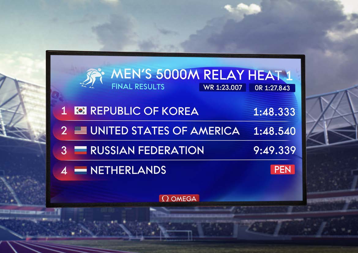
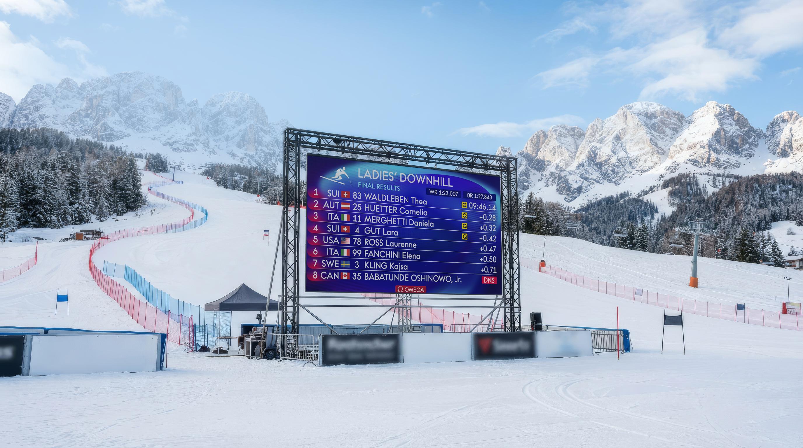
Outdoor LED panels, checked in daylight and under floodlights.
Decision 01
Legibility, decided by LED panels,not by taste.
Every screen was checked against spec, sent to Swiss Timing, then tested on their indoor and outdoor LED walls. The first round came back with three instructions: switch to Omega's typeface, push the type bigger, make the colours darker and stronger. What looked balanced on my monitor washed out in daylight — so the scale was rebuilt around what survived the wall.
Decision 03
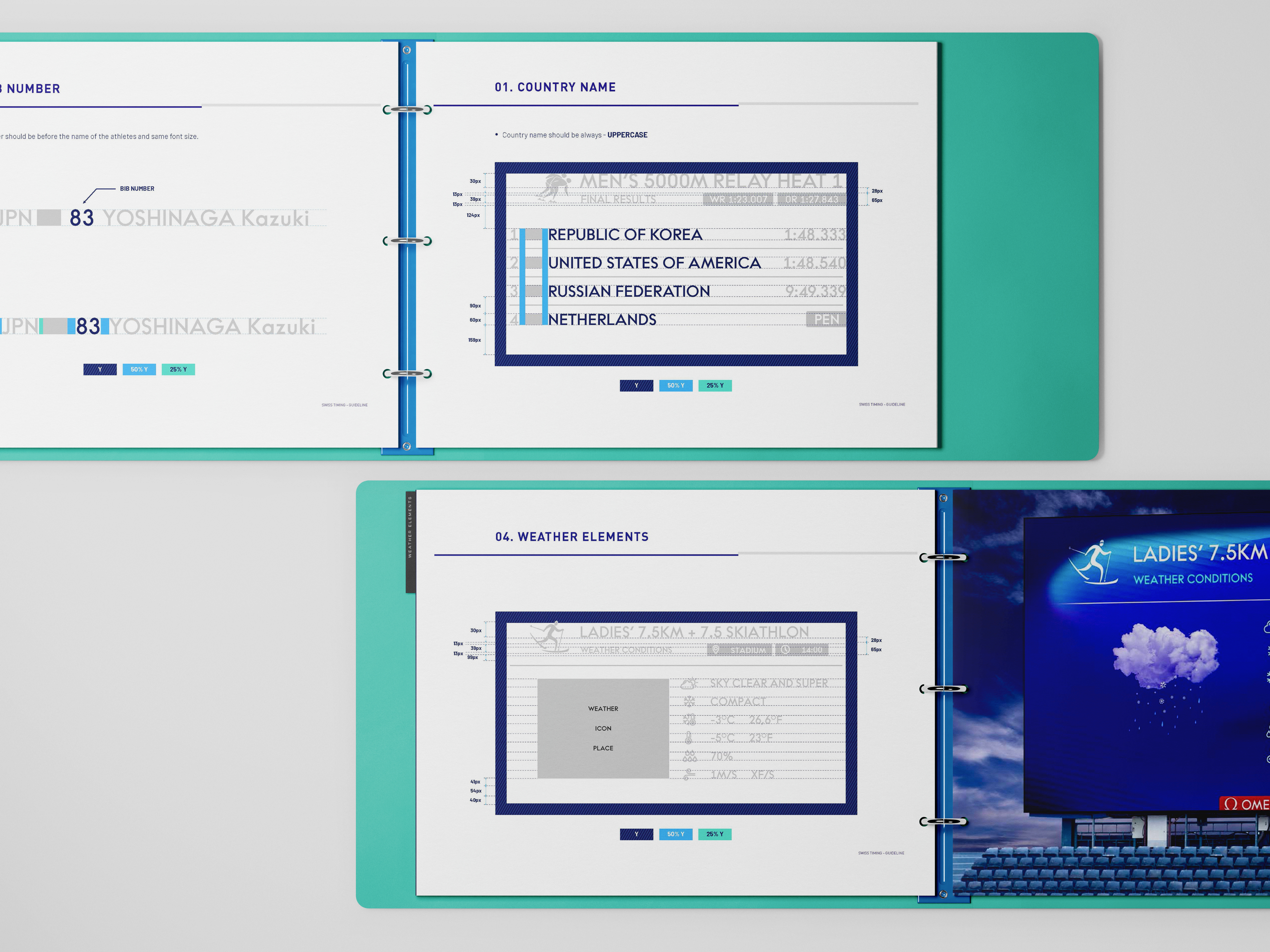
A book so the systemcould grow without me.
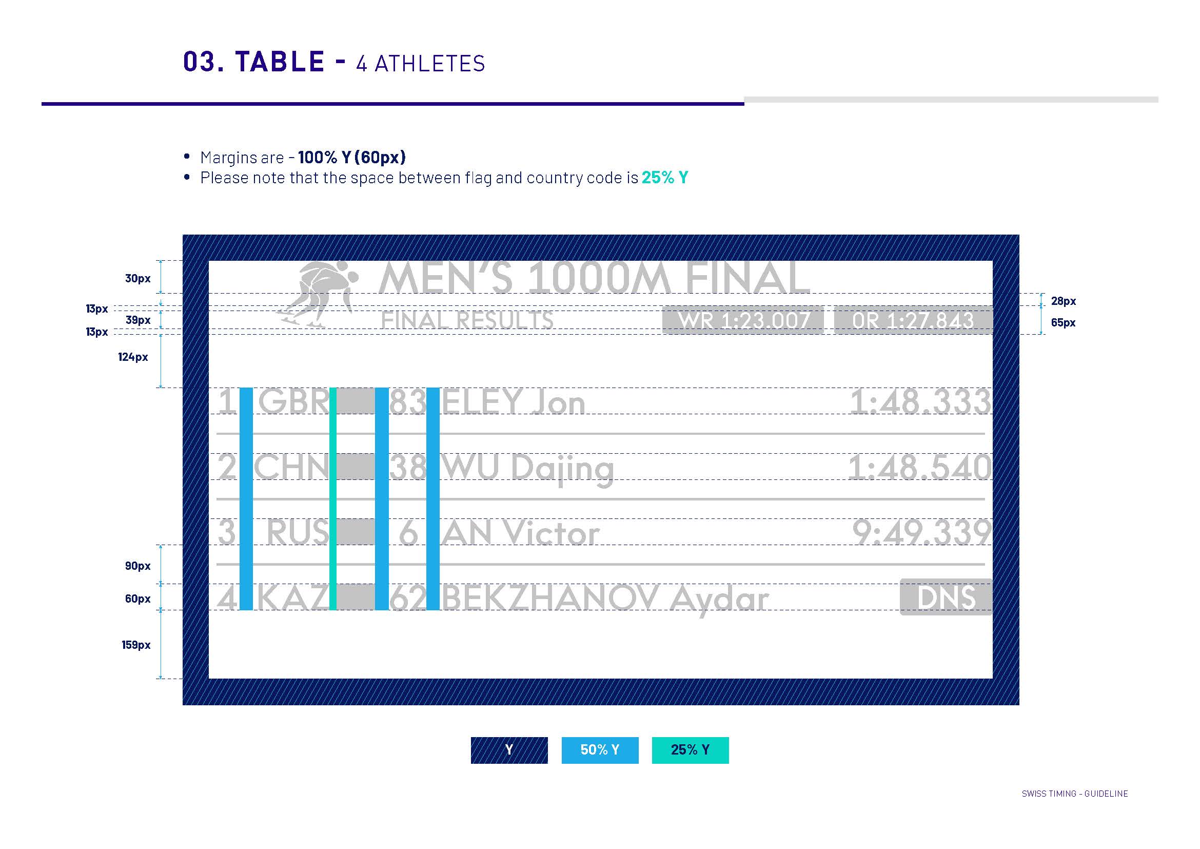
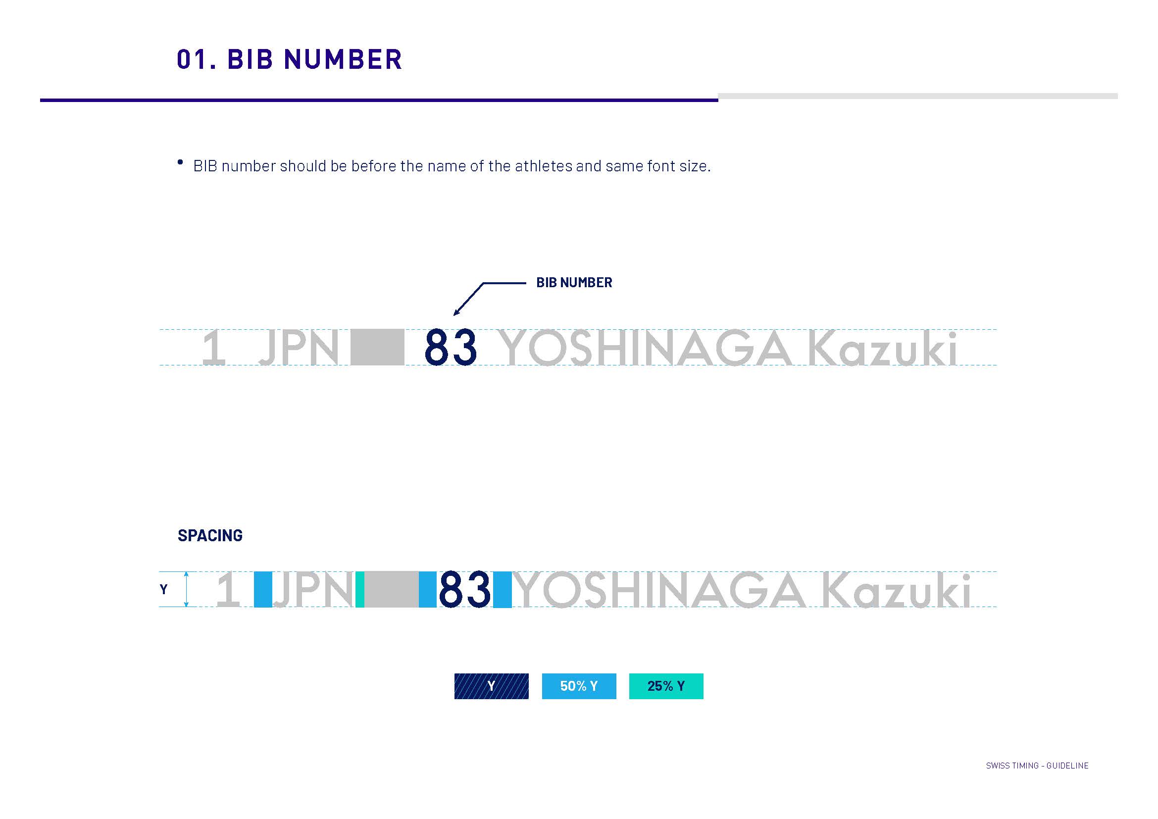
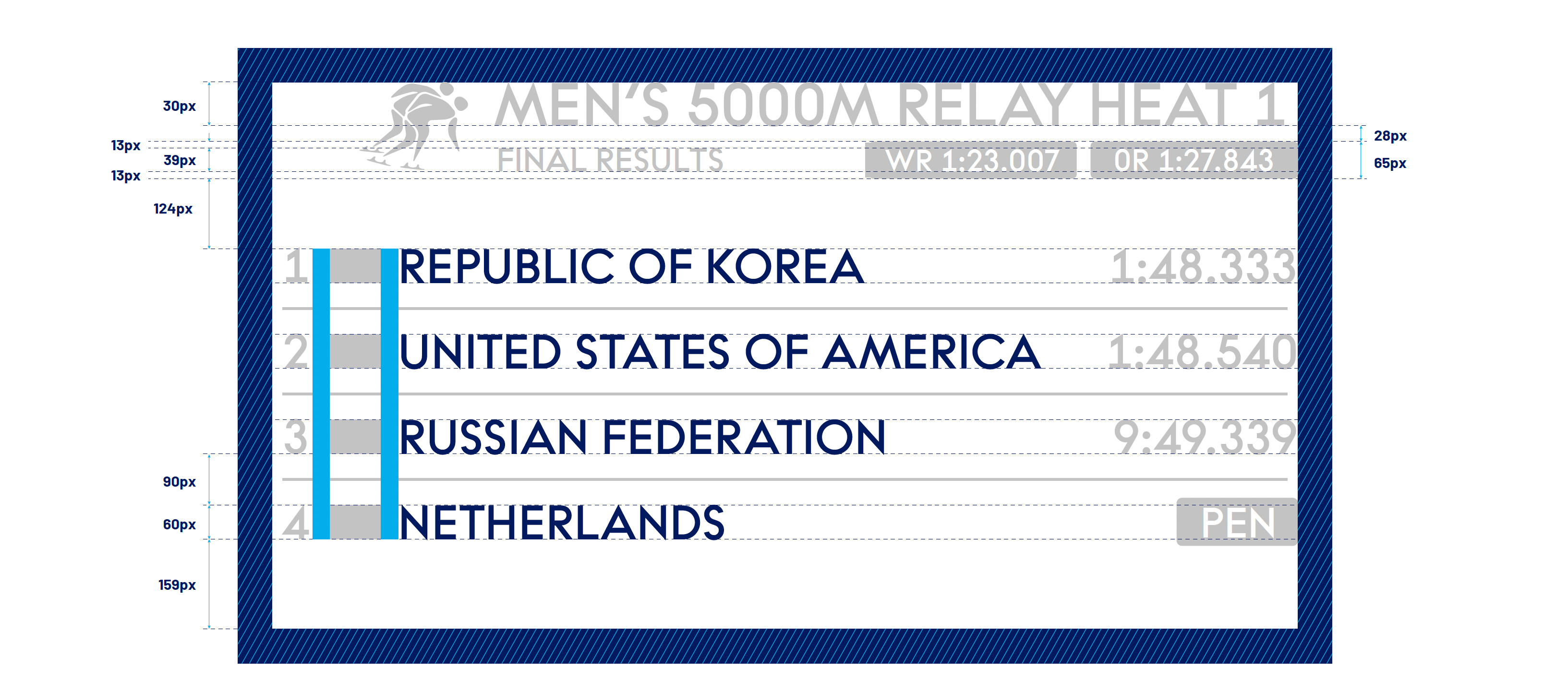
Swiss Timing needed to add disciplines later. The brandbook specifies pixel dimensions, uppercase rules for country names, flag treatment and the logic behind each decision — not just what the boards look like, but why they look that way.
Decision 02
Eight screen categories, one grammar.
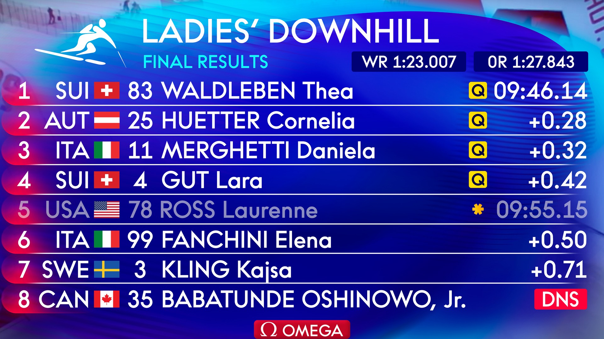
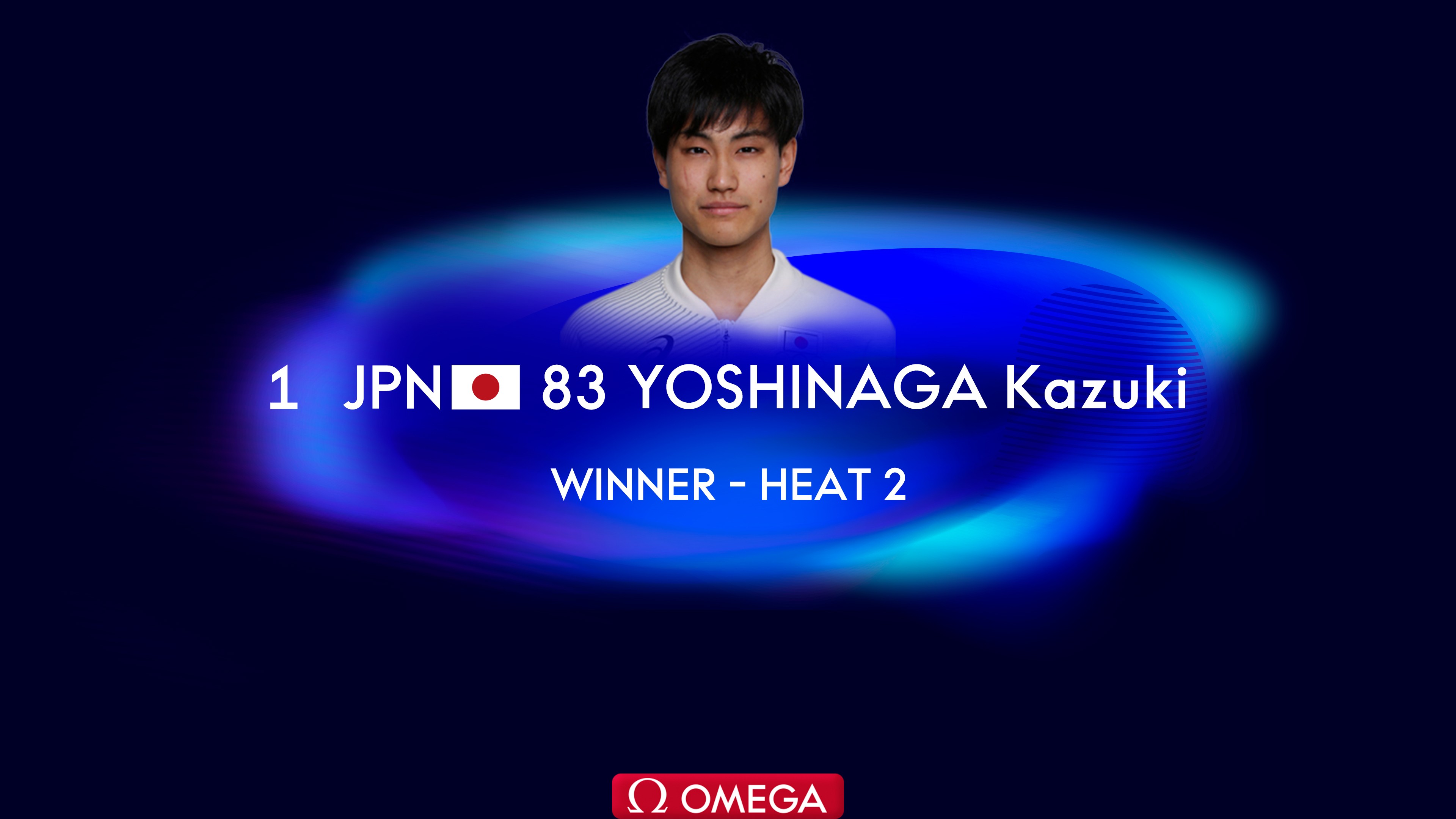
Main table, athlete and team presentation, pursuit relay, bobsleigh, slalom, break screens, weather - each with completely different data. I kept the frame constant — position, flag, name, time, gap- and let only the payload change, so a spectator who learns one screen can read all eight.
The brandbook
Seventy-two pages.
Every rule Swiss Timing needed to keep building without me.
Typefaces, spacing, flag position, uppercase logic - written down once, so no one had to ask.
This is the actual document, page by page.
Not a summary of it.
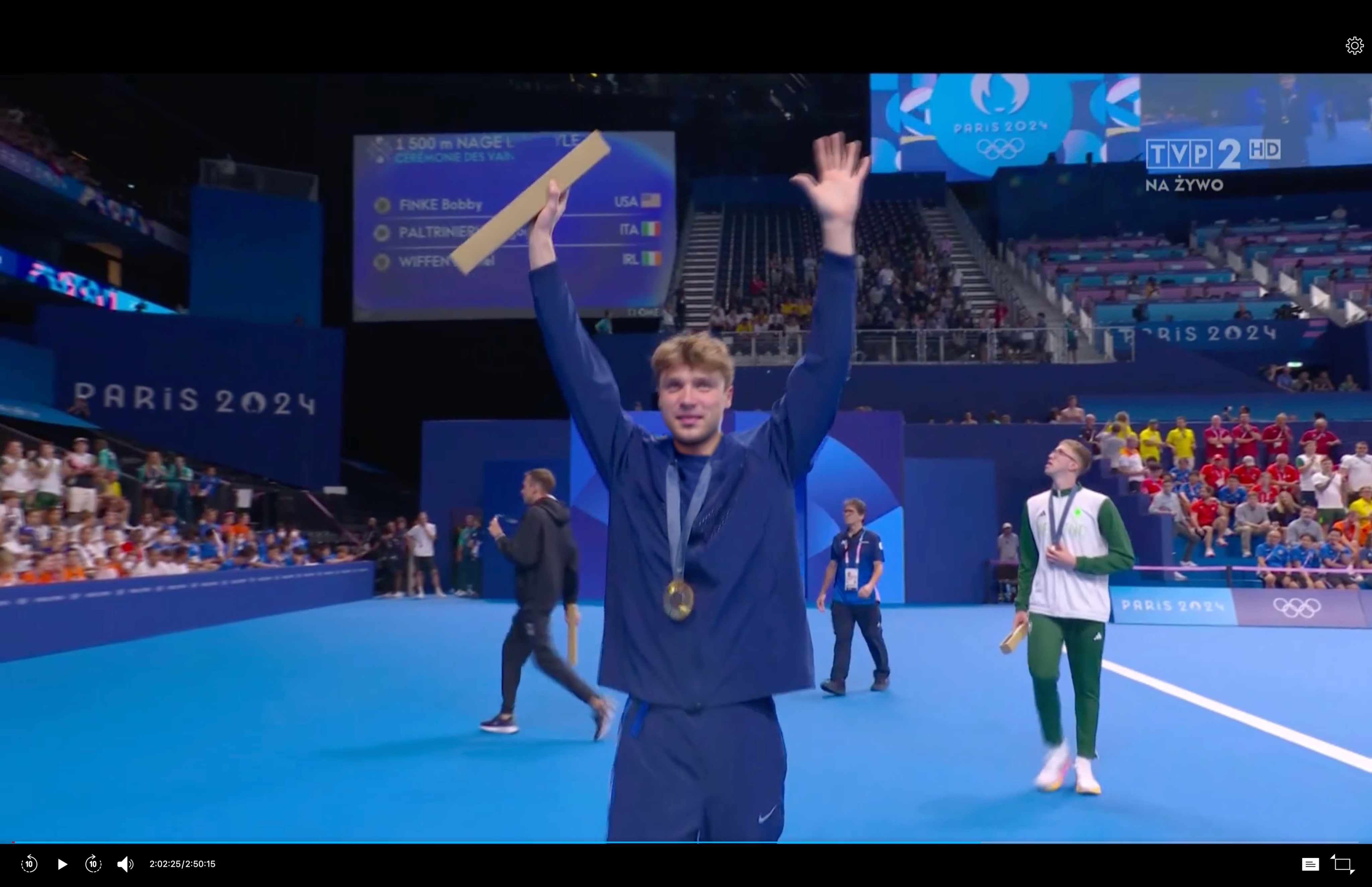
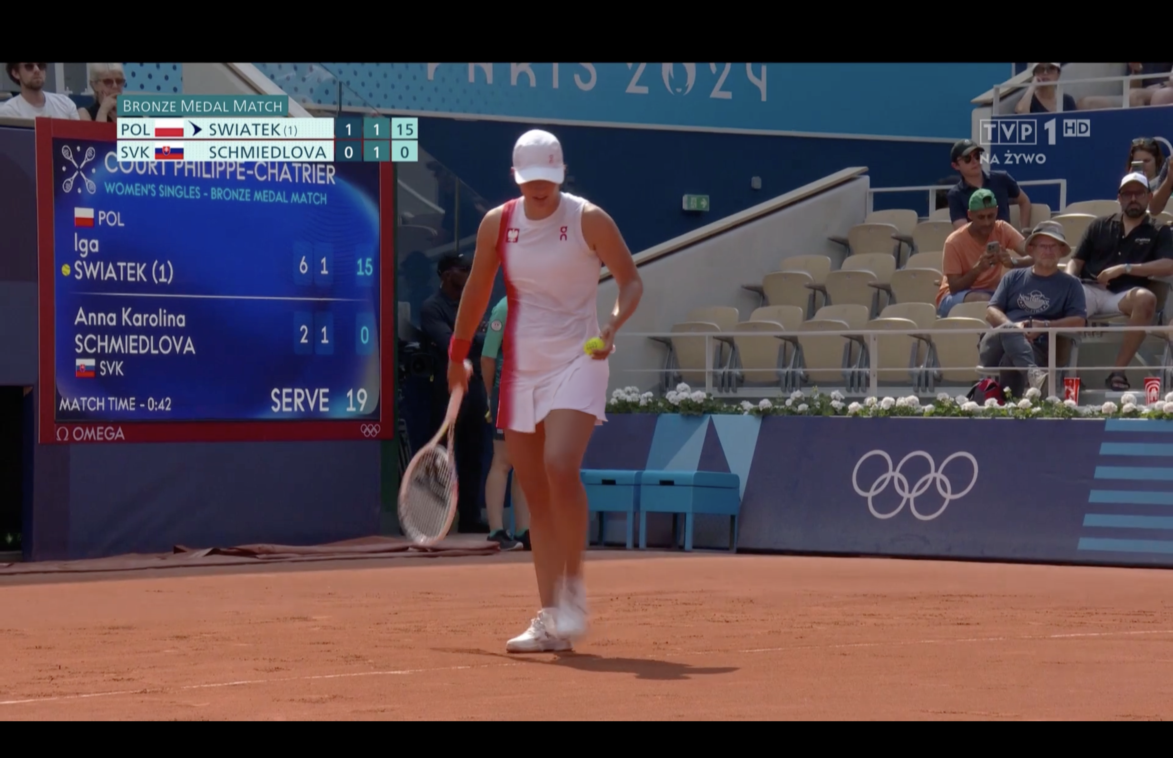
System in action
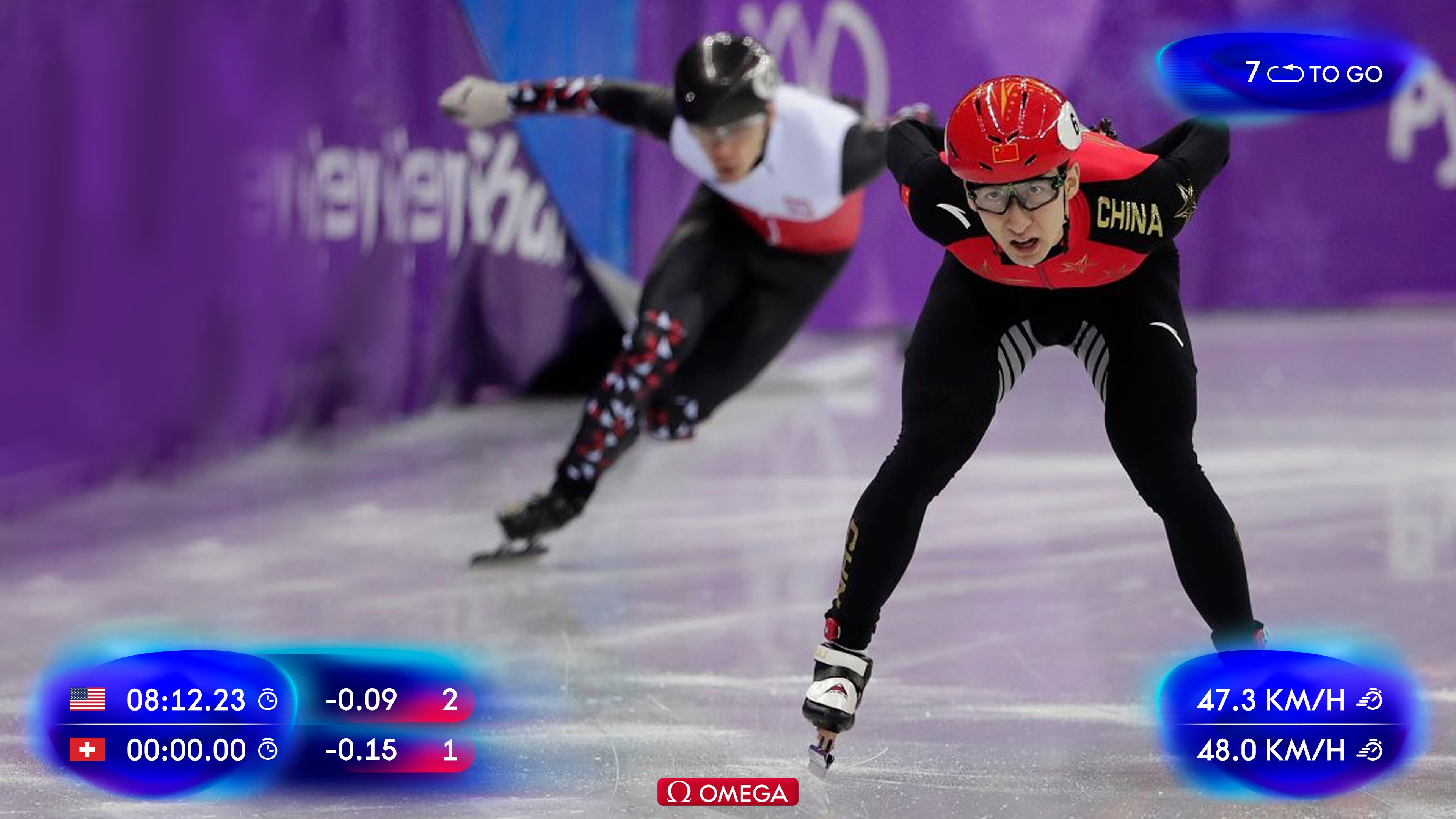
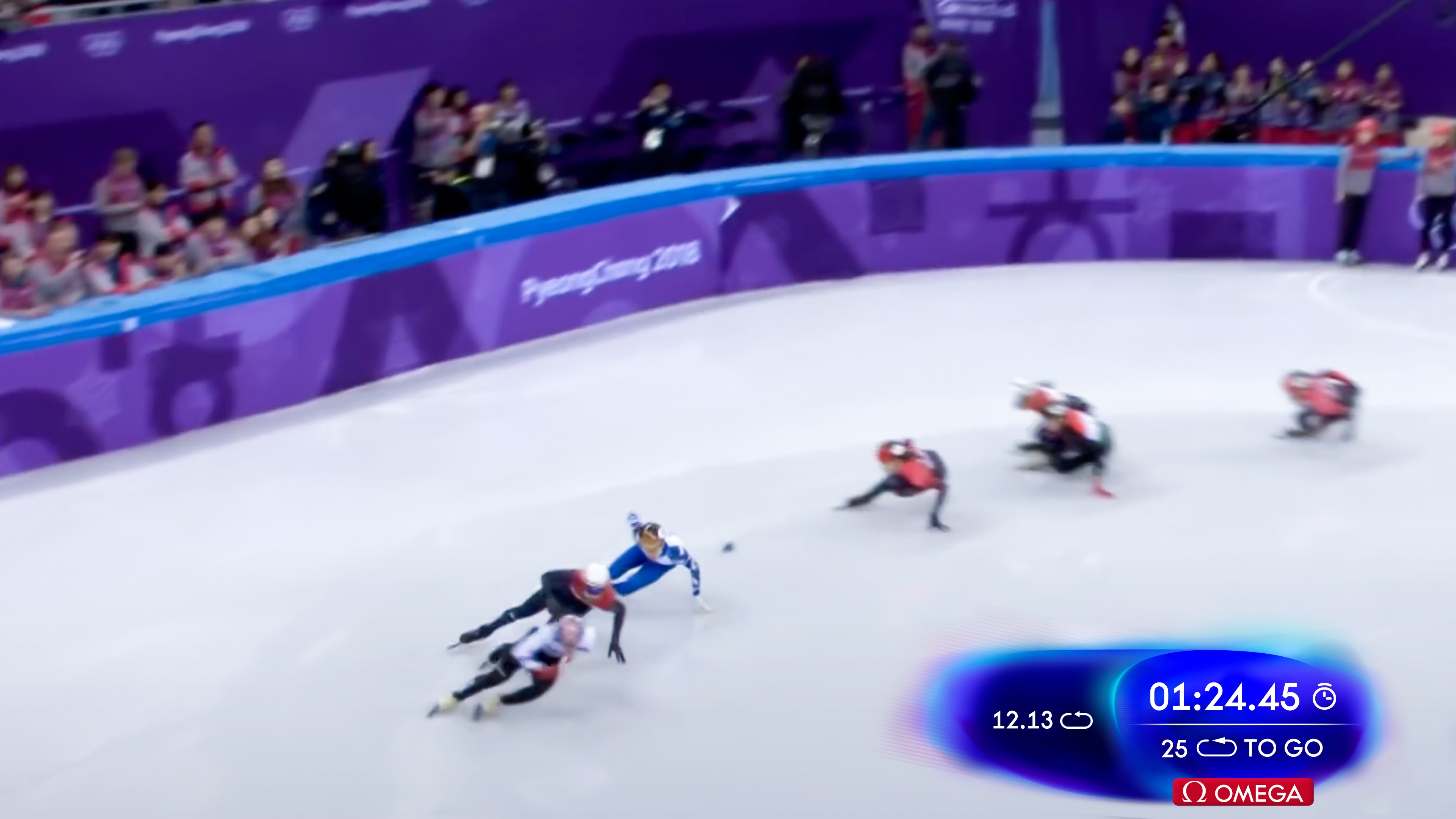
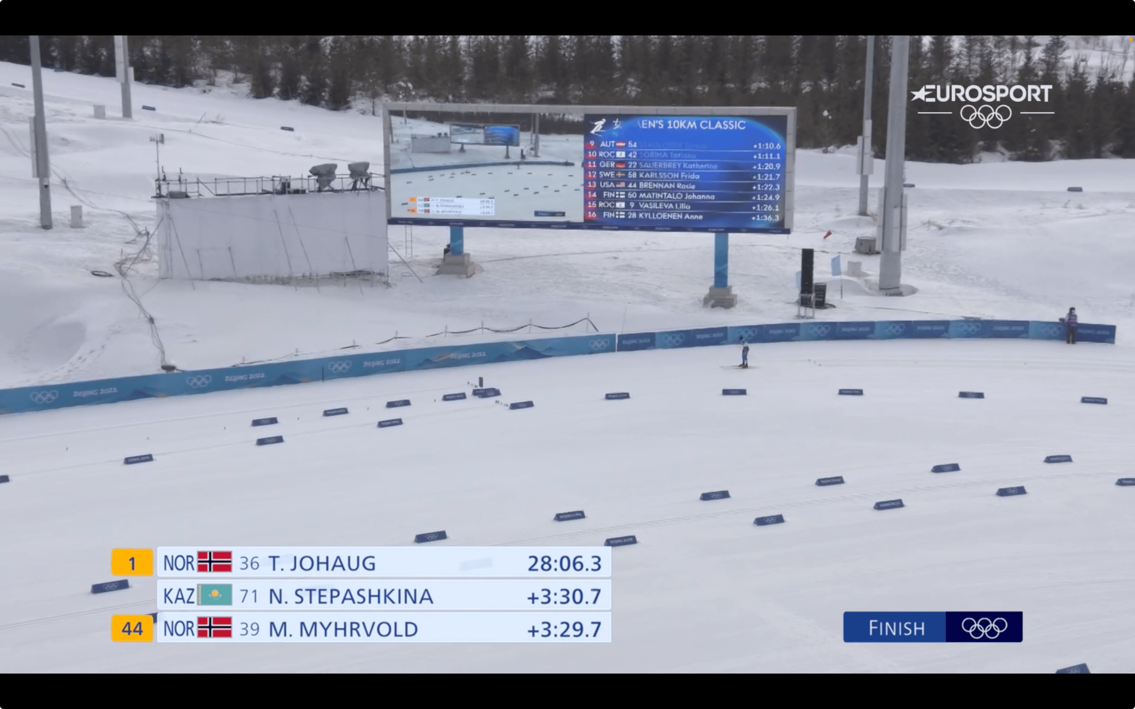
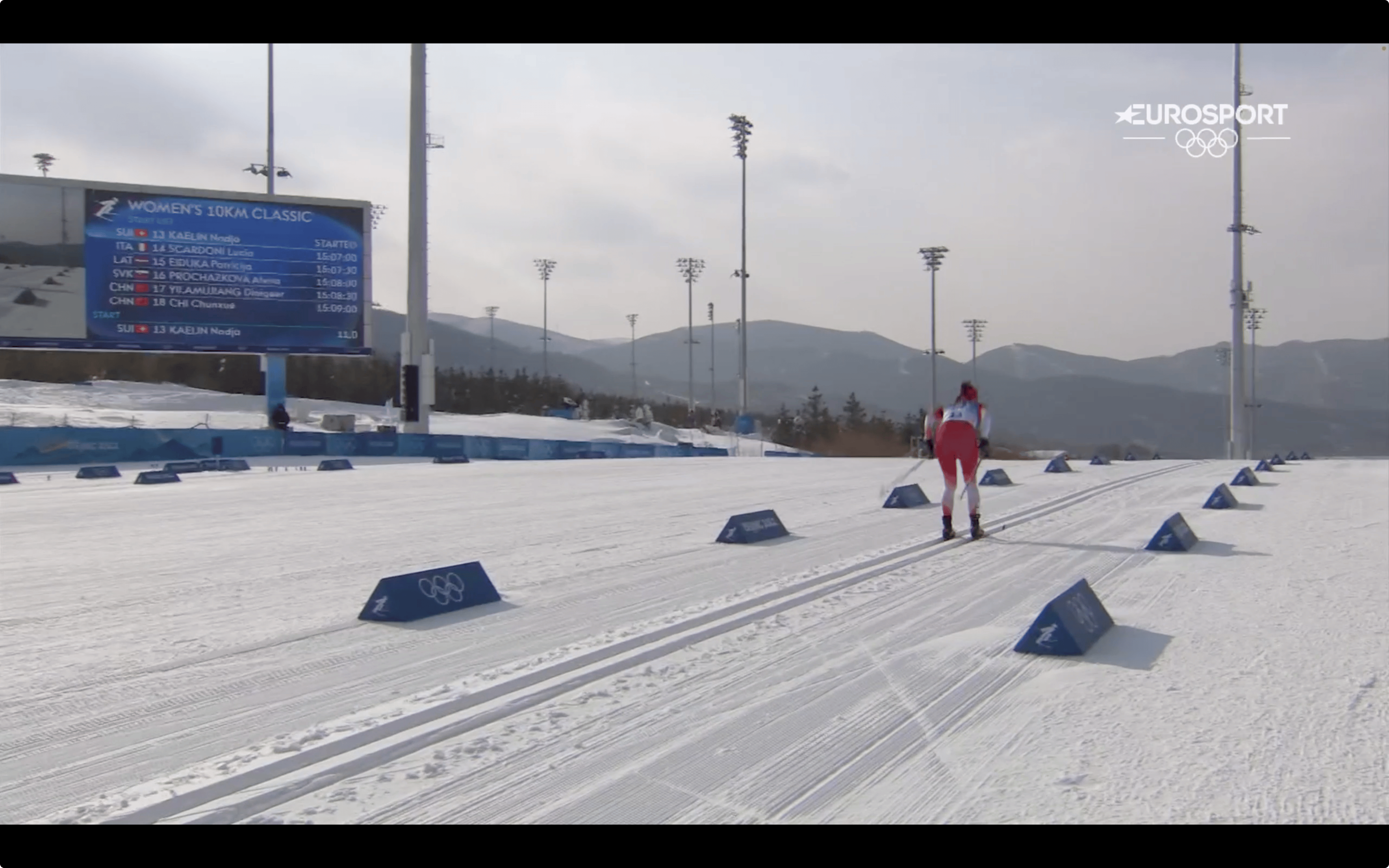
Not a mockup. This is what viewers actually saw.
Broadcast stills from Beijing 2022 and Paris 2024.
Broadcast and Olympic imagery shown for non-commercial portfolio demonstration only.No affiliation with or endorsement by the IOC or the broadcasters is claimed.All rights remain with their respective owners.

Weather icon set
Every condition the broadcast needed to show, drawn one by one.